
Weekly Dev Roundup: Sept 28–Oct 5
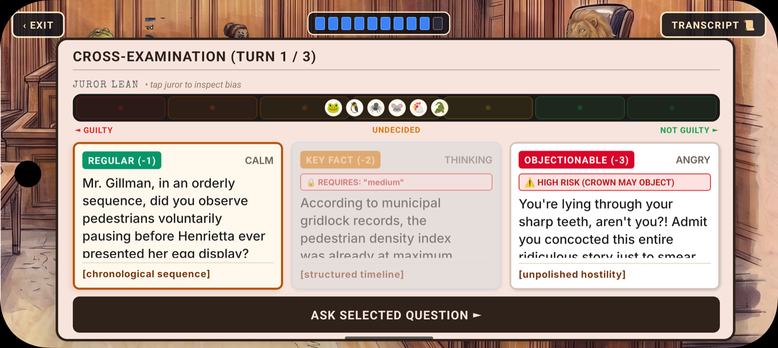
One of the things that happens after you ship a big system is that you spend the next week discovering all the places it was supposed to reach but didn't quite get there yet. Last week the opportunity system landed — the three-tier cross-examination that replaced the old easy/medium/hard picker — and it was a proper teardown; the question pipeline, the schema, the frontend dialogs, all of it got rebuilt around recording key facts during direct and deploying them strategically during cross. It worked, but the rest of the trial was still running on the old assumptions. This week was about chasing those ripples all the way to the end of the courtroom.
Special Bylaw Unit: The Ripples Reach the Verdict
Every change this week was about making the trial feel like a single continuous experience instead of a sequence of disconnected screens. When you change how cross-examination works, you're also changing what information the jury receives and how — and that means the verdict screen, the closing arguments, and the halftime recess all need to understand the new reality.
The Verdict Screen Gets Rebuilt
The biggest single change this week was the verdict ruling screen. I'm not going to pretend it was glamorous work — it was a rebuild of a single screen that touched nearly two thousand lines of frontend code — but it matters because of when it happens in the trial flow. The ruling is the payoff. Everything you've done — the direct examination, the cross-exam, the key facts you recorded, the objections you risked, the leans you shifted — all of it converges on this one screen.
The new version follows the same structure as the jury halftime recess: an interactive zoom walkthrough that lets you inspect each juror before the final decision. Instead of just being told the verdict, you get to see the panel one by one, the way you would during halftime, and understand why each juror voted the way they did. It's the same visual language, the same navigation pattern — it turns the ruling from a results screen into the final chapter of the same story, told in the same voice.
I'm not quite done with it yet, though. The walkthrough structure is in place, but I still want to add a dramatic reveal — the first juror standing up and delivering the verdict before you see the rest of the panel. That moment where the foreman rises and the room goes quiet is the emotional peak of every courtroom drama, and right now the screen just shows you the walkthrough without that beat of anticipation. It's coming.
Closing Arguments Match the Courtroom
The closing arguments delivery screen got the same treatment. Before this week, the closing argument view looked like its own thing — functional, but disconnected from the rest of the trial's visual identity. Now it matches the courtroom witness view, which means the prosecution's closing and the defense's closing both feel like they're happening in the same room as the testimony. It's one of those changes where nobody's going to send you a thank-you card — nobody notices when visual continuity is right — but if you'd left it as two different-looking screens, every player would feel the seam.
And the defense closing preparation screen — the one I talked about last week with the desk background and the thought clouds — got further refinement. The handwritten notepad scribbles are in, the Caveat font is loaded, and the whole flow of choosing your argument angle and watching the view auto-advance feels settled now. It's the quiet moment before the big speech, and it lands.
The Jurors Become Visible
Here's the change I'm most excited about: the juror lean bar.
Behind the scenes, the server has been tracking juror leans for a while now — each animal on the panel has a lean value that shifts based on testimony, objections, and cross-exam performance. But the player couldn't see it in any detailed way. You'd get a general sense from the halftime recess, but during the actual questioning, you were flying blind.
This week added a proper visual lean bar with colored blocks and bias tags — a horizontal strip that shows each juror's current lean at a glance. It's color-coded from red through green, and each juror gets a bias tag that tells you what kind of argument they're most swayed by. Tap a juror and you get an inspect modal with the full lean breakdown. Suddenly the jury isn't a black box you're throwing arguments at; it's a room full of characters with opinions you can actually read.
This isn't just UI polish — it changes how you play. When you can see that Juror #4 is leaning innocent and has a bias toward emotional appeals, you start picking different questions. You start thinking about which witness to call, which key fact to deploy, which juror you're targeting. The strategy was always there in the code; now it's visible on the screen.
When Witnesses Break
The last commit of the week added a mechanic I've been wanting since the beginning: when a witness breaks during cross-examination — when your questioning lands hard enough that they visibly crack — the entire jury sways by two points.
This is the kind of moment that makes courtroom dramas work. A witness contradicts themselves, or a key fact you recorded during direct comes back to haunt them, or the objectionable question you gambled on actually lands — and suddenly the whole room shifts. The jury leans update in real time, and you can see it happen on the lean bars.
I wrote a full test suite for this mechanic because there are a lot of edge cases — what happens if a juror is already maxed out, what happens on a split panel, what happens when multiple witnesses break in the same trial. The lean system underneath it all is properly tested now, which means those dramatic courtroom moments aren't going to silently corrupt the jury state.
Cleanup in the Cross-Examination
Alongside all the new stuff, the cross-examination system got a cleanup pass. The legacy question weights — remnants of the old easy/medium/hard system — were removed entirely. The middle-tier questions (the key-fact questions) are now properly grounded in the facts the player actually recorded during direct examination, not some fuzzy fallback logic. And the witness service got slimmed down now that it doesn't have to juggle three different difficulty tiers with weights and fallbacks.
This is the kind of work that makes terrible commit messages — "remove legacy question weights" isn't going to win any awards — but it's what turns a system from "working" to "correct." The cross-exam now does exactly what the design says it should, and nothing else. No ghost logic from the old system hanging around in the background, no edge cases where the question generation falls through to a default weight that doesn't exist anymore.
The Quiet Corner
Doodle Doo, Headline Harmonies, ShutterClash, and Infinite Scribe all had genuinely quiet weeks — zero commits across the board. Four live games running smoothly while I tunnel-visioned on SBU's trial system. ShutterClash is still riding the post-launch calm after its App Store approval, and honestly, quiet weeks for live games are the good kind of quiet. They mean nothing's on fire.
What's Next
Now that the game's visual language is complete — the courtroom feels like one space, the jury is visible, the verdict screen follows the same walkthrough pattern as halftime — it's time for a cleanup pass. There are bugs that have been deferred, edge cases that work but don't feel right, and a handful of missing features that were skipped while the big systems were still in flux. The plan is to go through it systematically — squash the bugs, close the gaps — and then start testing, with the goal of shipping by the end of the month.
Have a good week, y'all.