
Weekly Dev Roundup: Sept 21–28
One of the things about last week that stuck with me is that I ended the roundup by saying "hopefully with fewer design documents and more code." Well, the code showed up.
Special Bylaw Unit: The Opportunity System Lands
Last week I talked about ripping out the old easy/medium/hard question system in favour of something that would actually make you think — an opportunity system built around recording key facts, deploying them strategically, and weighing risk vs. reward instead of just cranking the difficulty slider to eleven. That was all design work then; notes scribbled on paper, diagrams I'm not proud of.
This week it became code.
The cross-examination overhaul touched basically everything in the trial pipeline. Witness examination, cross-exam logic, question generation, the schema that holds it all together — it was a proper teardown and rebuild. The old system was simple to code but boring to play: pick a difficulty, get a question, repeat. The new one has three distinct tiers, and each one feels different.
First tier: a regular cross-examination question. Safe, low-stakes, the kind of thing you ask when you're testing the waters. No special requirements, no special risk — just a competent question that does the job.
Second tier: key-fact questions. This is where the mechanic from last week's design comes to life. During direct examination, you now have a legal notepad where you can record key facts from the testimony — things that seem off, contradictions you catch, details worth returning to. You can only hold three at a time, which means you're constantly making judgment calls about what's worth the slot. Record the right fact and you can deploy it during cross-exam for a pointed follow-up the witness can't easily dodge. Record the wrong one and you've burned a slot you might need later.
Third tier: the objectionable question. This is the high-risk play — the kind of question that might land beautifully and might get you sustained by the judge, costing you credibility with the jury. It's there for the moments when you're behind on leans and need to gamble, or when you've got the witness off-balance and want to press the advantage.
This is a real decision tree. Regular, key-fact, objectionable. Safe, strategic, risky. And the key-fact tier only exists because you earned it — because you were paying attention during direct and wrote down the right thing. That's the design I was chasing: choices that connect across the trial instead of isolated button presses.
Alongside the big cross-exam overhaul, I also went back and polished the halftime/jury recess view. The navigation between jurors was clunky — you'd sometimes get stuck on the wrong juror after zooming in — and the full-panel layout needed tightening up. The zoomed-out view that shows all six jurors and their lean states got streamlined, which sounds minor but makes a real difference when you're scanning the panel before heading into closing arguments. These are the kinds of fixes that don't make for a dramatic commit message but are the difference between "this feels like a prototype" and "this feels like a game."
The Defense Gets Its Look
The other big push this week was visual: the defense side of the courtroom got a complete aesthetic overhaul, and it changes how the game feels in a way that's hard to capture in words.
The defense witness selection screen went from a functional list to something that actually looks like a lawyer's desk. There's a rich wood-toned desk background now, and each witness candidate appears on a folio-style card — the kind of paper dossier you'd actually flip through while preparing for trial. It's the sort of detail that doesn't change a single mechanic but changes how you feel while making the decision. You're not picking from a menu; you're reviewing case files on your desk.
The witness questioning dialogs got the same treatment. The crown witness view had its continue and skip controls realigned to match the defense side, so there's now a consistent visual language across both sides of the aisle. One of those things you don't notice when it's right but absolutely notice when it's wrong — the prosecution's witness screen and the defense's witness screen now feel like they belong to the same game.
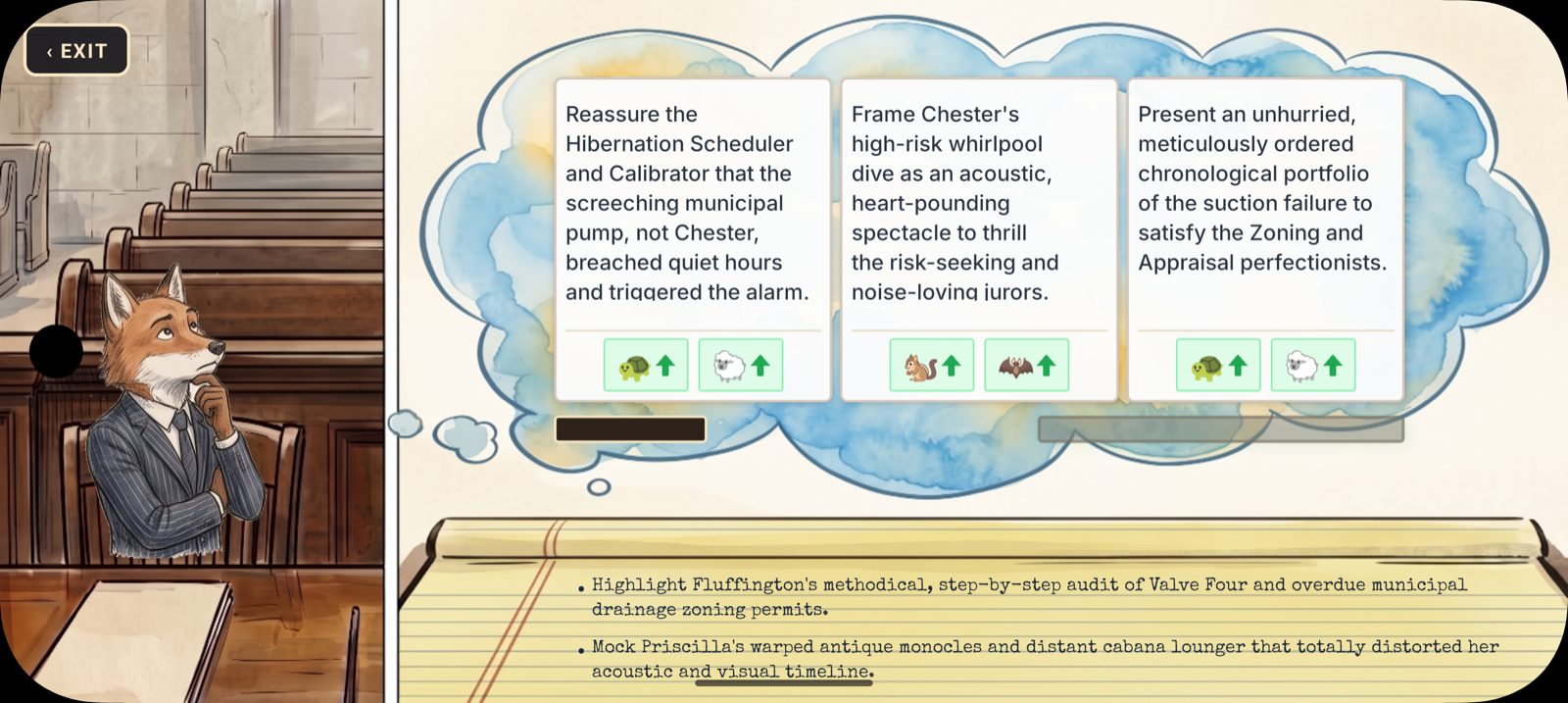
And then there's the closing arguments preparation screen, which might be my favourite thing I built all week. When the defense prepares for their closing statement, the screen transforms into a desk with a legal notepad. Three thought clouds float above the desk with different argument angles you can pursue — and you choose one by literally scribbling it onto the notepad. There's a new Caveat font loaded for the handwritten look, and after you select a note, the view auto-advances to the next set of options with a brief pause so you can register what you chose. It's this quiet, contemplative moment before the big speech, and it feels completely different from anything else in the game.
The key fact confirmation dialog also got cleaned up — the header is simpler now, and I removed an unnecessary warning that was making the mechanic feel more punishing than it actually is. Recording a key fact isn't a permanent commitment with dire consequences; it's a strategic choice you make in the moment, and the UI should reflect that lightness.
What ties all of this together is that the defense side of the trial now has a visual identity. The prosecution has always had the inherent drama of the state building its case — the crown prosecutor is inherently theatrical. But the defense was just... functional. Now it has a desk. It has folios. It has a notepad with thought clouds and handwritten scribbles. It feels like you're actually preparing a defense, not just tapping buttons on a phone.
The juror lean system underneath all of this — the server-tracked leans that shift based on testimony and objections, the visual lean bars, the halftime summaries — is still bedding in. But with the question system rebuilt on top of it and the defense side finally getting its visual due, the whole trial flow is starting to feel cohesive in a way it hasn't before. The jurors aren't just NPCs waiting for the end to deliver a verdict; they're characters with opinions that you can see shifting, and the questions you ask are actual strategic decisions instead of difficulty picks. And now the defense lawyer has a desk that looks like a desk.
The Quiet Corner
Doodle Doo, Headline Harmonies, Infinite Scribe, and ShutterClash all had genuinely quiet weeks — zero commits across the board, just running smoothly in production while I focused on SBU's trial system. That's kind of the dream for a live game, honestly: it just works while you build the next thing. ShutterClash especially, fresh off its App Store approval last week, is in that honeymoon phase where no news is good news.
It's going to be an interesting fall. SBU's trial system is hitting its stride, and the courtroom is finally starting to look as good as it plays. More next week.
Have a good weekend, y'all.